| dtdate | Distraction | Essentials | Sanity | Wellness | PersDev | ProfDev |
|---|---|---|---|---|---|---|
| 2023-02-10 | 0.6322222 | 6.285278 | 1.5500000 | 0.7836111 | NA | NA |
| 2023-02-13 | 0.6616667 | 5.285278 | 0.5566667 | NA | 2.3925000 | NA |
| 2023-02-14 | 1.0436111 | 6.801389 | 0.6250000 | 0.6636111 | 0.7350000 | NA |
| 2023-02-15 | 0.6611111 | 3.718056 | 1.2347222 | NA | 2.8708333 | NA |
| 2023-02-16 | 1.9377778 | 5.551667 | 0.5000000 | 1.9127778 | 0.7752778 | NA |
| 2023-02-17 | 1.3572222 | 3.295278 | 1.2613889 | 0.4233333 | 1.7458333 | NA |
Analyzing every minutes of my spare time in R: 6 months of time tracking insights
life
R
data
viz
dplyr
2023
What does the time tell me?
I’ve always believed that how I spend my spare time will have an impact on my future. Based on this philosophy, I started tracking my spare time, which includes any time outside of sleep hours and my 9-5 work schedule. I now have over 6 months’ worth of data, and here are my findings I’ve done with R.
Time tracking category
To get started, I came up with 6 main categories.
- Essentials: This includes activities like eating, showering, doing chores and grocery shopping
- Sanity: Things that aren’t essential but are important for maintaining my sanity, including reading articles, trying out new apps, and engaging in quality leisure activities e.g. playing video games
- Professional development: Skill development that would bring direct benefit to my professional career
- Personal development: Hobbies or skills that are not related to my career. They are skills that hold long-term value to me, such as knitting, blogging and website tweaking
- Wellness: Mental and physical well-being activities, such as talking to my husband/cats and strength training
- Distraction: “Zombie mode”. Mindless scrolling on social media, or idle time when I’m not doing anything particularly useful
Data preparation
My data is partially synced to Google Calendar (see Apps I used for time tracking for more details), with each event representing an activity. I exported all calendars as .ics files, converted them to csv utilizing the ics2csv library, and then used bind_rows to combine them with my other csv files.
Since I don’t publish the data, I won’t delve into all the details of data cleaning and aggregation, as they aren’t reproducible. However, here are a few things I considered:
- There were a few days I didn’t have complete data because I switched the tool. These need to be excluded to get an accurate daily average.
- I also changed the granularity of the category in the middle by adding more sub-categories. To ensure consistency, I rolled these sub-categories to the their parent categories, so that all categories are reported at the same level. A useful function here is
case_match, which is suitable to map multiple values to the same output. - To aggregate the data, I counted the hours of each category on each day by
group_byandsummarize, and then reshaped the data usingpivot_wider. - I separated the data into two data frames by weekday and weekend , because I obviously have more spare time on the weekend, and I don’t want this variance to be spread out if I were to do a daily average
After the preparation, I have two data frame: hrs_weekday and hrs_weekend, which contain the breakdown of each category on weekdays and weekends, respectively. The structure of data frames looks like below.
Each column is a category, and each row represents the daily sum of the corresponding category on a given day.
In addition, I created a constant midpoint, which is the midpoint of all date. This will help formatting the labels later when plotting time series graphs.
Where did my time go?
After excluding sleep and work hours, my activity breakdown looked like this in a pie chart.
Click to show the code
# Import library ----
library(tidyverse)
library(ggplot2)
library(ggTimeSeries)
library(ggrepel)
library(grid)
library(gridExtra)

# Define colour palette ----

custom_colors <- c("Essentials" = "#F2E1C9", "PersDev" = "#ADD4CD", "ProfDev" = "#b6dcf5", "Distraction" = "#FDBAA0", "Sanity" = "#D1D9EA", "Wellness" = "#DBEFBA")

# By activity ----

## Prep ----

# Reshape the data and calculate total/avg/percentage spent of each category
get_main_cat <- function(df) {
  df %>%
    pivot_longer(!dtdate, names_to = "main_cat", values_to = "daily_spent") %>%
    group_by(main_cat) %>%
    summarize(
      total_spent = sum(daily_spent, na.rm = TRUE),
      avg_spent = total_spent / n_distinct(.$dtdate)
    ) %>%
    mutate(
      pct_spent = total_spent / sum(total_spent),
      # Get the positions for plotting pie chart
      # Source: https://r-charts.com/part-whole/pie-chart-labels-outside-ggplot2/
      csum = rev(cumsum(rev(avg_spent))),
      pos = avg_spent / 2 + lead(csum, 1),
      pos = if_else(is.na(pos), avg_spent / 2, pos)
    )
}

cat_weekday <- get_main_cat(hrs_weekday)
cat_weekend <- get_main_cat(hrs_weekend)

## Plot category ----

# Plot pie chart
plot_main_cat <- function(df, p_title) {
  ggplot(df, aes(x = "", y = avg_spent, fill = main_cat)) +
    # Plot the pie of main_cat
    geom_bar(stat = "identity", width = 1, color = "white") +
    coord_polar(theta = "y", start = 0) +
    # Add daily avg label for pie chart
    geom_label_repel(
      aes(y = pos, label = paste(main_cat, "\n", round(avg_spent, 2), "h")),
      colour = "black",
      seed = 0,
      force = 0.6,
      segment.colour = NA,
      show.legend = NA
    ) +
    # Add percentage
    geom_text(aes(x = 1.6, y = pos, label = paste0(round(pct_spent * 100), "%")),
      fontface = "bold"
    ) +
    theme_void() +
    scale_fill_manual(values = custom_colors) +
    labs(
      subtitle = p_title,
      caption = paste("Total =", round(sum(df$avg_spent), 1), "hours"),
    ) +
    theme(
      plot.subtitle = element_text(hjust = 0.5, vjust = -3),
      legend.position = "none",
      plot.caption = element_text(hjust = 0, vjust = 30, size = 11) # Set caption to left align
    )
}

p_cat_weekday <- plot_main_cat(cat_weekday, "Weekday")
p_cat_weekend <- plot_main_cat(cat_weekend, "Weekend")

title <- textGrob("How I spent my spare time", gp = gpar(fontsize = 16, font = 2)) %>%
  arrangeGrob(zeroGrob(),
    widths = unit(0, "npc"),
    heights = unit(c(1, 0), c("cm", "npc")),
    as.table = FALSE
  )

cap <- textGrob("*Exclude sleep and work hours", gp = gpar(fontsize = 10, font = 3)) %>%
  arrangeGrob(zeroGrob(),
    widths = unit(0, "npc"),
    heights = unit(c(0, 10), c("cm", "npc")),
    as.table = FALSE
  )
p_cat <- grid.arrange(p_cat_weekday, p_cat_weekend,
  ncol = 2,
  top = title, bottom = cap
)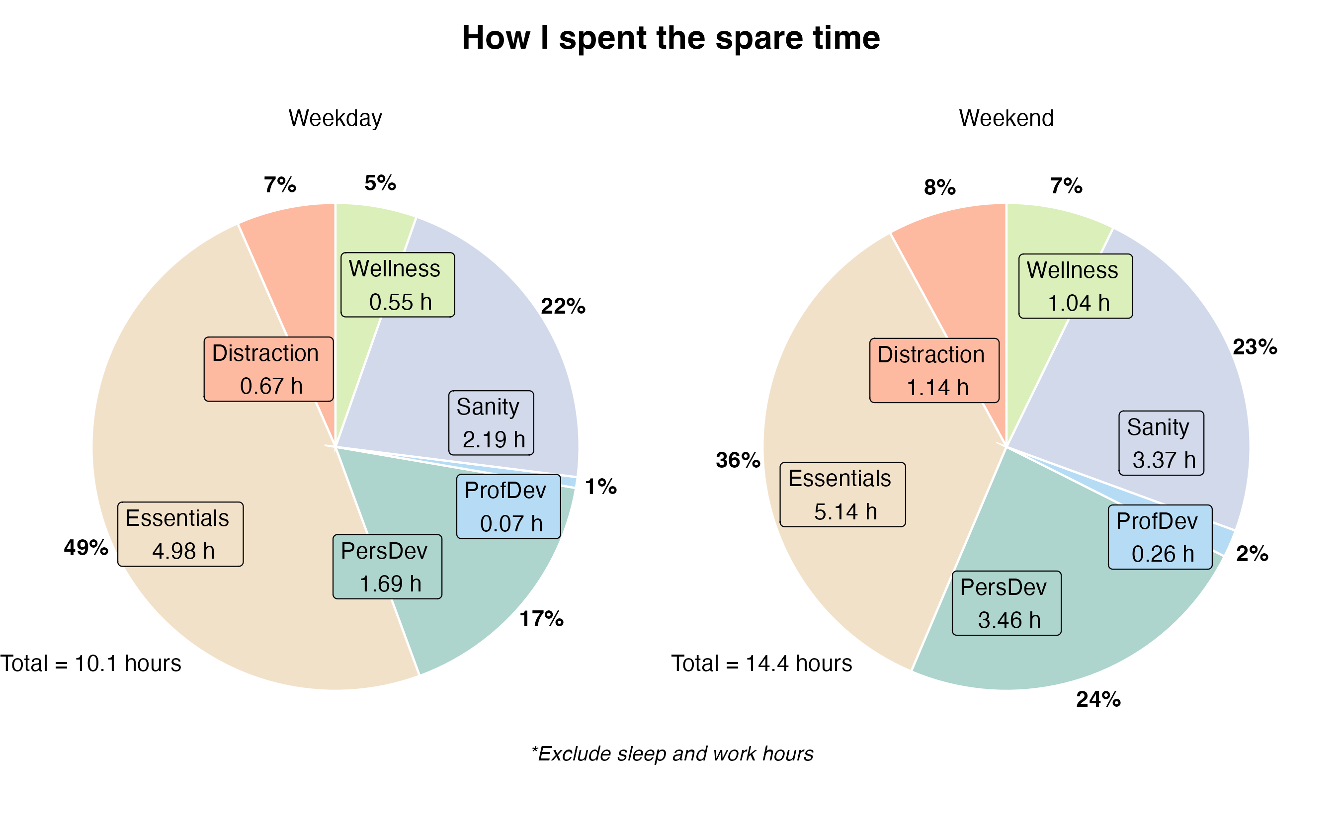
On an average weekday, I have a total of 10.1 hours available after excluding Sleep and Work hours. On the weekend, I have 14.4 hours.
The biggest category is Essentials. I spent an average of ~5 hours each day on life essential activities, which may seem like a lot, but it really isn’t, considering non-routine chores such as grocery shopping.
Sanity (2-3 hours) also took up a significant portion on both weekdays and weekends. These activities are, in a way, also essential to me because they are necessary to keep my sanity in check.
Personal development is the one that shows the most variance; I spent 1.77 hours more on it during the weekend. This makes sense, since I have more free time to invest in my hobbies on the weekends.
I’m glad to find out that Distraction wasn’t as bad as I thought. I spent roughly 40 minutes on mindless scrolling on the weekday, and a bit more on the weekend.
The pie chart is probably the most tricky one, because it has two sets of labels — daily average and percentage — and I need to ensure that both labels align with the corresponding portions. Due to this reason, it’s necessary to get the position before creating the graph and applying them to y in aes(). After plotting the pie chart for weekdays and weekends, I use gridExtra::grid.arrange() to combine two pies, and grid::textGrob() to format the title and captions.
How much time is necessary to keep life going?
By my definition, Essentials include both activities to keep the body alive, as well as house chores. These are the times I cannot cut.
So, how much time is necessary to keep my body alive and my life going? The answer is 4.98 hours on weekdays, and 5.14 hours on weekends.
Click to show the code
# Essentials and free time ----

## Prep ----
# Spare hours: everything exclude work hours and sleep time
# Devt hours: personal devt + professional devt
# Free hours: spare hours that are not in Essentials cat

get_essentials_wk <- function(df) {
  df %>%
    mutate(spare_hr = rowSums(across(where(is.numeric)), na.rm = TRUE), # Sum all spare hours
           devt_hr = rowSums(across(c(PersDev, ProfDev)), na.rm = TRUE)) %>% # Calculate the total hours of skill development
    mutate(free_hr = rowSums(across(-c(Essentials, spare_hr, dtdate, devt_hr)), na.rm = TRUE)) %>% # Calculate the free hour = spare hours - essentials
    group_by(week = week(dtdate)) %>%
    mutate(wk_spare = mean(spare_hr),
           wk_essentials = mean(Essentials),
           wk_free = mean(free_hr)) %>%
    ungroup()
}

essentials_weekday <- get_essentials_wk(hrs_weekday)
essentials_weekend <- get_essentials_wk(hrs_weekend)

## Plot Essentials ----

plot_essentials <- function(df, p_title) {
  avg_essentials <- mean(df$Essentials) # Calculate the average essentials hours
  ggplot(df) +
    # Plot essentials by day
    geom_point(
               aes(x = dtdate, y = Essentials),
               color = "#eed8b9",
               size = 1) +
    # Plot essentials by week
    geom_line(
              aes(x = dtdate, y = wk_essentials),
              color = "#e3bf8b", linewidth = 1) +
    # Add mean trend line
    geom_hline(
      yintercept = avg_essentials, color = "#766e53", linetype = "dotted",
      linewidth = 0.7
    ) +
    labs(x = "", y = "Hours", title = p_title) +
    scale_x_date(date_breaks = "1 month", date_labels = "%b") +
    scale_y_continuous(limits = c(0, 15)) + # set the y axis limit to 15 hours
    theme_minimal() +
    theme(
      plot.title = element_text(hjust = 0.5, vjust = 1.5, size = 15),
      plot.margin = unit(c(0.5, 3, 0.5, 0.5), "cm"), # Set margin to allow space for annotation
      panel.grid.major = element_blank(), # Remove grid lines
      axis.title.y = element_text(size = 10)
    ) +
    annotate("text",
      x = max(df$dtdate) + 22,
      y = avg_essentials,
      label = paste("Avg Essentials\n", round(avg_essentials, 2), "h"),
      color = "black",
      size = 3.5
    ) +
    coord_cartesian(xlim = c(min(all_data$dtdate), max(all_data$dtdate)), clip = "off") # Set the x axis limit
}

p_essentials_weekday <- plot_essentials(essentials_weekday, "Essentials hours spent, weekday")
p_essentials_weekend <- plot_essentials(essentials_weekend, "Essentials hours spent, weekend")
p_essentials <- grid.arrange(p_essentials_weekday, p_essentials_weekend, nrow = 2)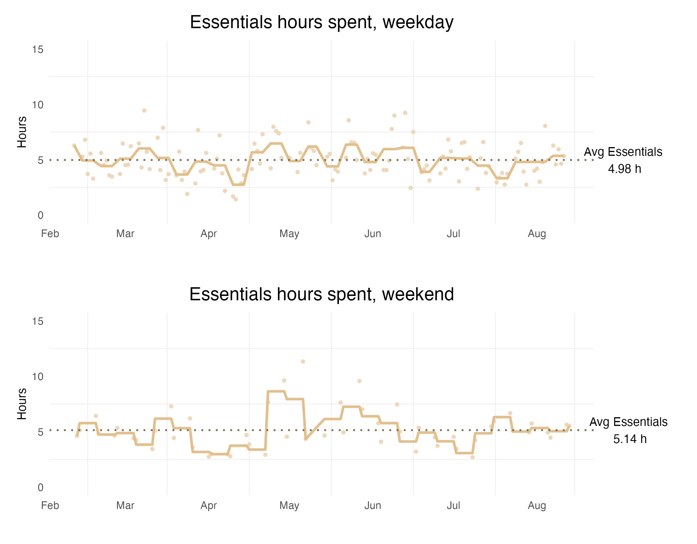
The brown line represents the weekly average, while the dots are the daily sum. I think a weekly average would be more meaningful to look at, because it balances out those non-daily essential activities and isn’t as fluctuate as daily averages.
On the weekend graph, there was a peak in May, because I spent almost the entire day doing adulting chores on that weekend.
How much free time did I actually have?
One of the most important insights I want to gain from time tracking is to figure out how much time I actually have to do my own stuff. After excluding sleep, work and life essentials, I have 5.27 hours on an average weekday and 9.32 hours on an average weekend to enjoy my life.
Click to show the code
## Spare/free/essentials ----

plot_spare_time <- function(df, p_title) {
  avg_free <- mean(df$free_hr) # Calculate the average hours spent
  ggplot(df, aes(x = dtdate)) +
    geom_ribbon(aes(ymin = wk_spare, ymax = 24, fill = "Sleep/Work")) +
    geom_ribbon(aes(ymin = 0, ymax = wk_spare, fill = "Free")) +
    geom_ribbon(aes(ymin = 0, ymax = wk_essentials, fill = "Essentials")) +
    scale_fill_manual(values = c(custom_colors, "Sleep/Work" = "#F6F6F5", "Free" = "#C2DEDC")) +
    labs(title = p_title,
         x = "",
         y = "Hours") +
    scale_x_date(date_labels = "%b", date_breaks = "1 month") +
    theme_minimal() +
    theme(
      plot.title = element_text(hjust = 0.5, vjust = -1, size = 15),
      axis.title.y = element_text(size = 10),
      panel.grid.major = element_blank(), # Remove grid lines
      panel.grid.minor = element_blank(),
      legend.position = "bottom",
      legend.title = element_blank()) +
    geom_hline(yintercept = avg_free, color = "#44867d", linetype = "dotted",
               linewidth = 0.7) +
    annotate("text", x = midpoint, y = avg_free,
             label = paste("Avg Free =", round(avg_free, 2), "h"),
             color = "black", size = 4,
             vjust = 1.5
    )
}

p_spare_weekday <- plot_spare_time(essentials_weekday, "Available free time, weekday")
p_spare_weekend <- plot_spare_time(essentials_weekend, "Available free time, weekend")
p_spare <- grid.arrange(p_spare_weekday, p_spare_weekend, nrow = 1)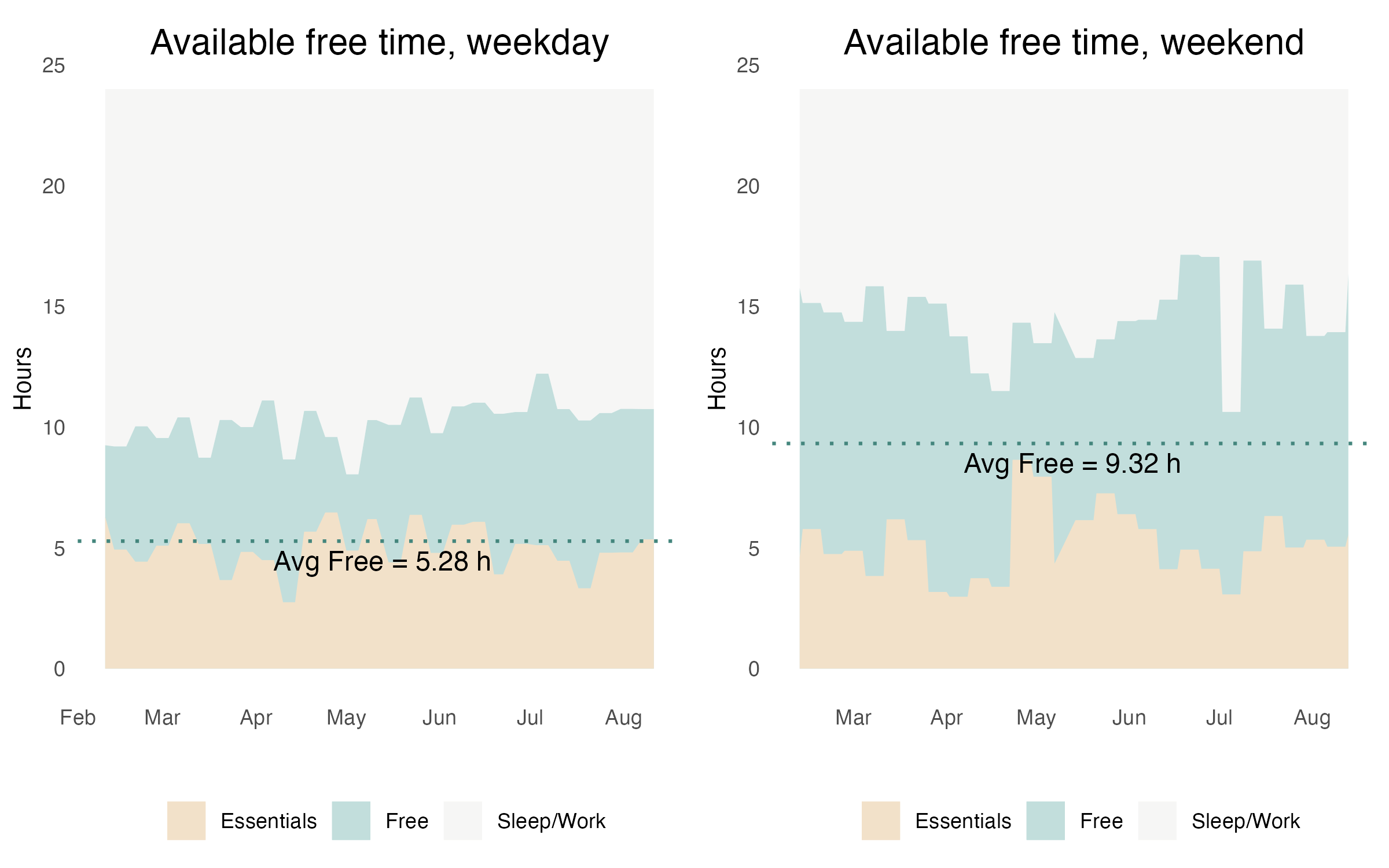
The light green area represents the actual Free time I have, while the light brown is the Essentials, and the white area is Sleep/Work hours. These add up to 24 hours on the y-axis, so each area reflects the true portion of the entire time. Once again, the data is based on weekly average to avoid the over-fluctuation of daily averages.
Investing time in myself
The categories I use to evaluate my productivity are Personal development and Profession development. I decided to combine these two categories into a single one “Skill development”, knowing that the majority of it was contributed by the former, such as personal hobbies.
On an average weekday, I spent 1.77 hours on skill development, while on weekends, I dedicate 3.72 hours to it, which is almost 2 hours more in comparison. The significant variance (ranging from 0 to 9+ hours per day) is interesting to look at, mostly because of my flow state style of doing tasks.
Overall, not bad, I would say.
Click to show the code
# Skill development ----
# Devt = PersDev + ProfDev hours

## Prep ----
# Combine weekday and weekend entry, and fill the blank with 0 to avoid grey area in graph
hrs_all <- rbind(hrs_weekday, hrs_weekend) %>%
  complete(dtdate = seq(min(dtdate), max(dtdate), by = "day"),
           fill = list(devt_hr = 0))

# Calculate weekly average
devt_weekday_avg <- mean(hrs_weekday$devt_hr) %>% round(., 2)
devt_weekend_avg <- mean(hrs_weekend$devt_hr) %>% round(., 2)

## Plot development hour chart in calendar heat map ----
p_devt <-
  ggplot_calendar_heatmap(
    hrs_all,
    cDateColumnName = "dtdate",
    cValueColumnName = "devt_hr",
    dayBorderSize = 0.35,
    dayBorderColour = "grey",
    monthBorderSize = 0.35,
    monthBorderColour = "dimgrey",
    monthBorderLineEnd = "round"
  ) +
  xlab(NULL) +
  ylab(NULL) +
  scale_fill_continuous(low = "white", high = "#45ccc7") +
  theme(
    plot.title = element_text(hjust = 0.5, vjust = 1.5, size = 15, face = "bold"),
    axis.title.y = element_text(size = 10),
    axis.ticks = element_blank(),
    legend.position = "right",
    legend.title = element_blank(),
    strip.background = element_blank(),
    strip.text = element_blank(), # useful for only one year of data
    plot.background = element_rect(color = "white"),
    panel.border = element_blank(),
    panel.background = element_blank(),
    panel.grid = element_blank(),
    plot.caption = element_text(hjust = 1, vjust = -5, size = 11)
  ) +
  labs(
    title = "Skill development",
    caption = paste("Weekday Avg =", devt_weekday_avg, "h\n",
                    "Weekend Avg =", devt_weekend_avg, "h"))

p_devt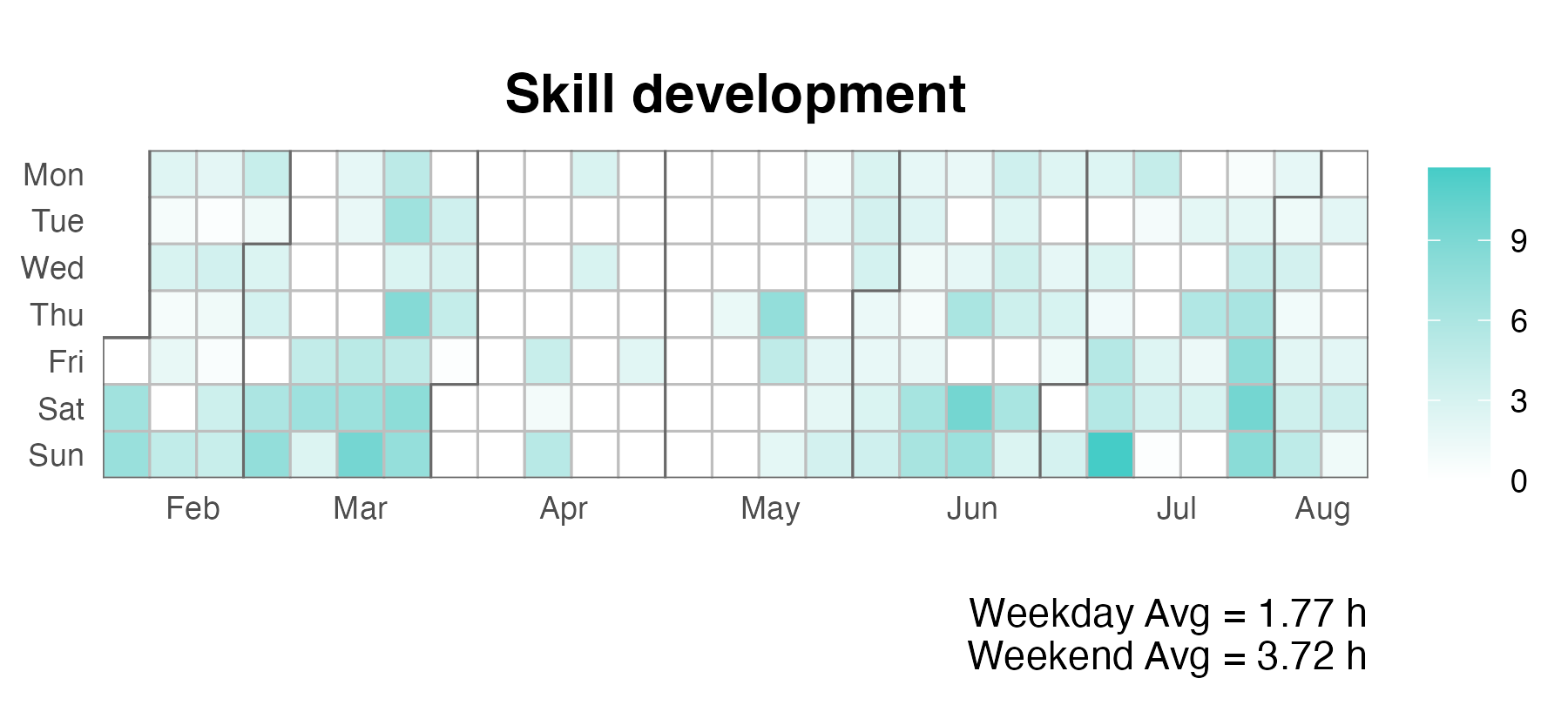
I chose heat map because I want to see how my productivity fluctuated as the season changed. To do this, I combined the weekdays and weekends data frame, filled in blank with zero, and then used ggplot_calendar_heatmap() in the ggTimeSeries library to plot the calendar heat map.
May seems to be the low point, mainly due to the peak in the Essentials graph when I’m busy at chores. April is also low, and I wanted to see what happened in April to cause that downfall. The natural assumption is that I was busy doing something else, but what is it? Let’s find out.
Was I more productive when I spent less time on social media?
The answer is No. To my surprise, Sanity and Skill development were substitutes to each other. That means when I didn’t want to spent time on developing my hobbies and skills, I tended to choose to entertain myself with activities like playing games instead of scrolling on social media.
Click to show the code
# Correlation Dist/Devt ----

## Prep ----

dis_devt <- hrs_all %>%
  mutate(
    # Convert NA to 0
    Sanity = if_else(is.na(Sanity), 0, Sanity),
    Distraction = if_else(is.na(Distraction), 0, Distraction)
  )

## Plot correlation ----

p_dis_devt <-
  ggplot(dis_devt, aes(x = devt_hr, y = Distraction)) +
  geom_point(aes(color = Sanity), size = 2) +
  scale_colour_gradient(low = "#D1D9EA", high = "darkorchid") +
  theme_classic() +
  labs(x = "Skill development") +
  geom_smooth(method = lm) +
  theme(legend.position = "bottom")

p_dis_san <-
  ggplot(dis_devt, aes(x = Sanity, y = Distraction)) +
  geom_point(aes(color = devt_hr), size = 2) +
  scale_colour_gradient(low = "lightblue", high = "darkblue", name = "Skill development") +
  theme_classic() +
  geom_smooth(method = lm) +

p_devt_san <-
  ggplot(dis_devt, aes(y = Sanity, x = devt_hr)) +
  geom_point(aes(color = Distraction), size = 2) +
  scale_colour_gradient(low = "gold", high = "red") +
  theme_classic() +
  labs(x = "Skill development") +
  geom_smooth(method = lm) +
  theme(legend.position = "bottom")

# Define common x and y axis limits
common_limits <- coord_cartesian(
  xlim = c(0, 10),
  ylim = c(0, 10)
)

# Apply the common limits to each plot
p_dis_devt <- p_dis_devt + common_limits
p_dis_san <- p_dis_san + common_limits
p_devt_san <- p_devt_san + common_limits

p_cor <- grid.arrange(p_dis_devt, p_dis_san, p_devt_san, ncol = 3, widths = c(1, 1, 1))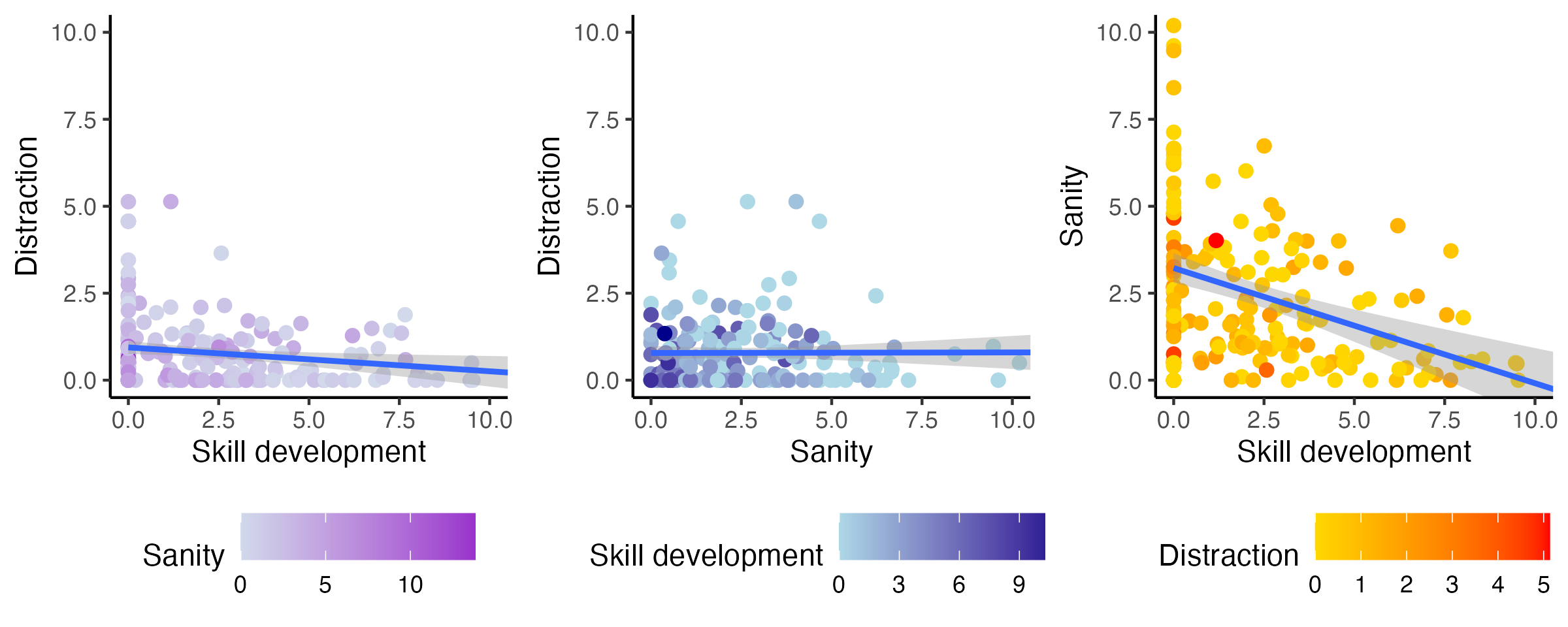
In the above chart, the three graphs show the relationship between Distraction, Sanity and Skill development. Each graph plots the relationship between two variables on the x and y using a scatter plot with a linear model, and the colour mapping of dots represents the third variable.
From the first two graphs, I didn’t see much correlation between Distraction and Skill development, nor Distraction and Sanity. The lines of linear model were almost flat. However, the third graph shows a correlation between Sanity and Skill development, making me draw the initial conclusion.
Another interesting fact is that my time spent on Distraction was relatively stable. As shown in all three graphs, Distraction ranged from 0 to 5 hours per day, and the colour mapping in the third graph looks quite consistent with very little variance.
Scatter plots are not hard to create, but when arrange all three in the same view, coord_cartesian() is necessary in order to keep the axes at the same scale.
Bonus: more activities at a glimpse
I mentioned that I’ve changed the category in the middle, because I realized that I need more details, especially for Personal development and Profession development, I want to know the exact time I spent on certain skills. For example, under Personal development, I created four sub-categories: Knitting, Blogging, Emacs and Website development.
After some aggregation from raw data, I have a data frame act that looks like this.
# A tibble: 12 × 3
  activity   main_cat    total_spent
  <chr>      <chr>             <dbl>
1 Blogging   PersDev           22.2
2 CasReading Sanity            25.9
3 Coding     ProfDev           15.7
4 Emacs      PersDev           42.2
...
And this is the breakdown of the total time I spent on each sub-category, based on 2 months of data.
Click to show the code
p_activity <-
  act %>%
  # Make sure activity is sorted by category
  arrange(main_cat) %>% # Sort by main_cat
    # This trick update the factor levels
    # Source: https://r-graph-gallery.com/267-reorder-a-variable-in-ggplot2.html
  mutate(activity = factor(activity, levels = activity)) %>%
  ggplot(aes(x = activity, y = total_spent)) +
  # Plot bar line
  geom_segment(aes(xend = activity, yend = 0), color = "grey") +
  # Add lolipop that filled with main_cat color
  geom_point(size = 4, aes(color = main_cat)) +
  # Add labels
  geom_text(aes(label = paste0(round(total_spent), "h")), hjust = -0.5) +
  scale_color_manual(values = custom_colors,
                     name = "Category") +
  coord_flip(ylim = c(0, max(act$total_spent) + 20), clip = "off") +
  theme_minimal() +
  labs(x = "Activity", y = "Hours", title = "How I spent my time, by sub-category") +
  theme(
    plot.title = element_text(hjust = 0.5, vjust = 1.5, size = 16, face = "bold"),
    panel.grid = element_blank(),
    axis.title.y = element_text(size = 10),
    plot.background = element_rect(color = "white")
  )

p_activity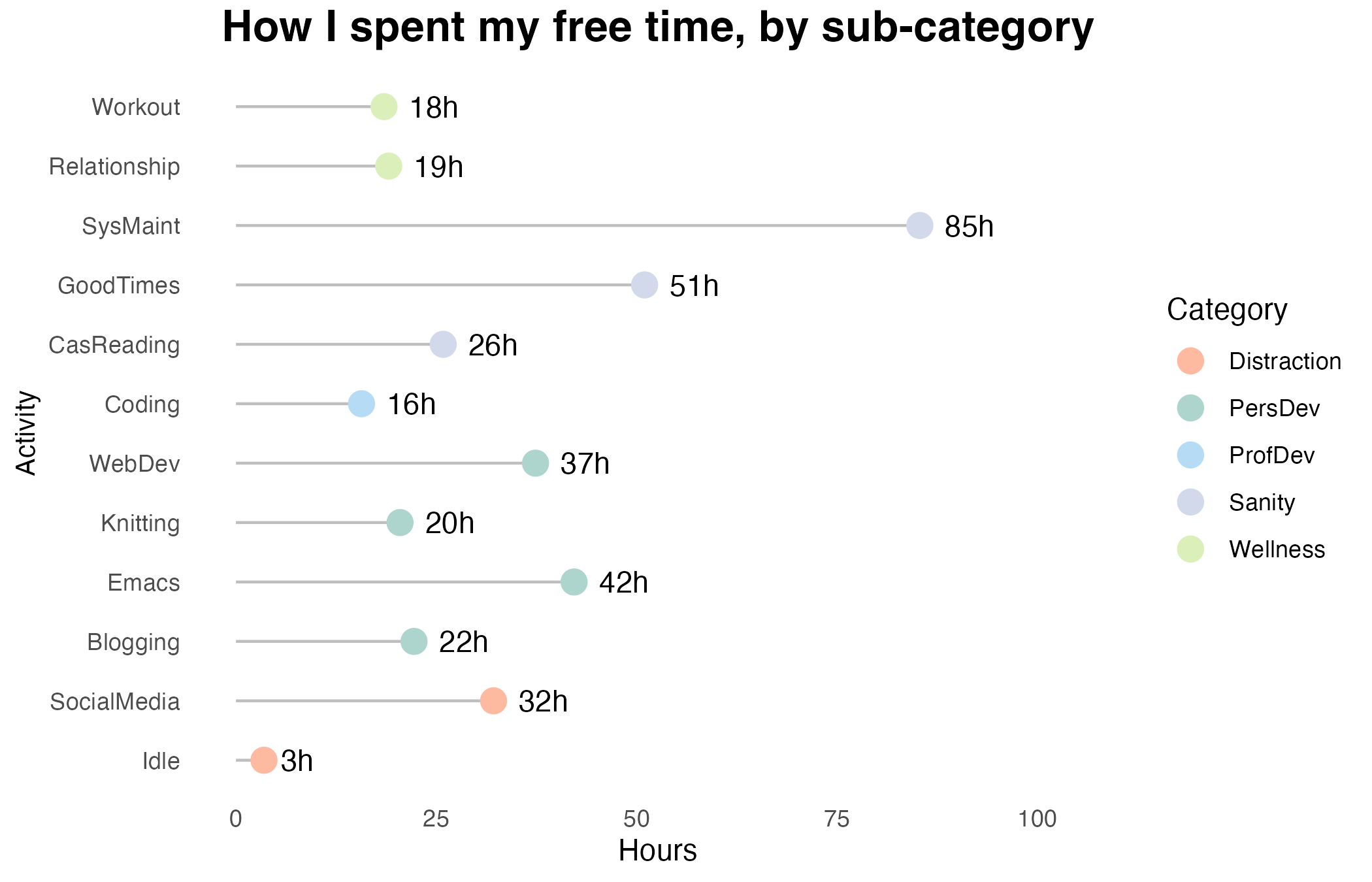
Each lollipop shows the total amount of time I spent on a sub-category in my free time, and I coloured the lollipop to reflect the parent category as shown in the legend. I didn’t go with daily or weekly average like previous graphs, because I only have 2 months of data and it’s not representative enough to conduct a daily average analysis. For example, last month I spent an insane amount of time (42 hours) on learning Org-mode (Emacs), but this is not something I would do every day.
System maintenance contributes a big portion to my free time. To clarify, it includes self-reflection reviews, tinkering with productivity systems, trying new apps, etc. I did spent a lot of time playing with some self-hosted apps recently, so it is entirely expected. Otherwise, I would reconsider the category and split it further.
When plotting the lollipop graph, I reordered each sub-category to ensure they are arranged by their parent category. There are many ways to do it, and I chose the dplyr way.
Apps I used for time tracking
The principle is simple. It needs to be easy and quick enough to track time. Anything that takes more than 10 seconds to track would not work for long period of time tracking.
-
I used this app initially and switched to Time Golden later. It has the functionality to sync to Google Calendar as well as csv export with paid version.
It’s easy to get started, and the UI looks polished. However, as I added more categories, it became difficult to quickly locate the category as it doesn’t have the parent-children layer. It also has the same drawback like many other tracking apps — I often forgot to start a task when I began doing something, and only realized it halfway through.
-
The philosophy of this app is quite unique. The user needs to tap only after finishing an activity, not before. This is because the app is based on 24/7 non-stop time tracking, which means any time that has passed has to be assigned to a category. Therefore, there are no more “blanks” when tracking time.
This makes a huge difference. Because 24/7 tracking means I can no longer lie to myself. If I can control when to start and end tracking, I tend not to record unproductive time and thus cheat the report. With non-stop tracking, I have to assign the unproductive time to something else if I were to cheat, which creates a psychological barrier against such behaviours.
The app has a relatively high learning curve, but after that, I found it’s extremely easy to track time because I can easily remember to tap it after I’ve done something.
I synced each category to a Google Calendar and then exported my data from there. I recently bought the paid version, which allows csv export.
Time I spent on this article
- Data prep: 2h11m
- Data analysis and visualization: 35h23m
- Article content: 8h42m
- Polish for publishing: 3h45m
Social media v.s others
What happened in April? It had a peak in the Sanity category. After checking my monthly review, I remembered that I spent lots of time playing video games with my husband, and it was also the time when I bought Hogwarts Legacy, which I put 80 hours into the game according to PS5 stats.
Click to show the code
Looking at other month, there were ups and downs. I have a vague feeling that there might be a negative correlation between Distraction and Skill development, meaning that when I was spending more time on social media, I probably didn’t have the mood to do anything productive.